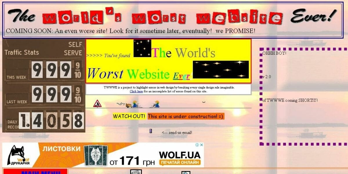
Images play a vital role in web design, but if they’re not chosen correctly, they can confuse or turn off your visitors. Images on a website should communicate the message you want your visitors to understand, not distract from it. Unfortunately, many businesses use irrelevant or low-quality images that turn visitors off. Additionally, cluttering your website with unnecessary images may take away their attention from your call to action (CTA).
Avoiding crowded websites
One of the most important things that you should avoid in web design is creating a crowded website. Such websites can confuse users and visitors. In a matter of seconds, they can get lost or even leave the site, and turn to the competition. Furthermore, crowded websites are hard to read.
Despite the fact that web design offers a wide variety of font styles, sizes, and animations, you should stick to easy-to-read lettering. You don’t want your visitors to struggle to read small, blinking text, or a fancy font. After all, you want them to enjoy their time on your website, right?
Using gzip compression
Gzip compression is a great way to reduce the size of web pages and make them load faster. It’s free to use and can greatly reduce the file size of your website. It’s also more efficient than other compression methods, which means that your page will load much faster. Many websites now use this method to reduce their file sizes.
Gzip is an algorithm that works by compressing text files and sending them to the browser. The browser will then unzip the file and read the original data. Gzip processes a wide variety of file types, including HTML. However, some file types are already compressed and may not benefit from the format.
GZIP is similar to other compression methods. It compresses the files on a website and sends them to the browser. The end user will have to uncompress them to see the content, but it helps speed up the transfer of the files. This will reduce the time it takes the site to load, and will reduce bandwidth usage. Most servers will enable GZIP on their servers.
GZIP compression can be a valuable tool in optimizing the speed of your website. By compressing your files, you can make them smaller without sacrificing the quality of the content. Increasing the speed of your site is important for user experience, bounce rate, and search engine rankings. GZIP compression is a great way to reduce the size of many types of web files and make your site load faster.
There are many tools available to help you test your site’s performance and speed. Many of these tools provide detailed reports about the speed of your website and recommend ways to improve the speed. They can also suggest compression algorithms. There are a variety of websites with these tools. For example, Small SEO Tools has a free tool that can help you check your site’s speed and use it to optimize your site.
Ignoring page speed
The speed of a website is a significant ranking factor for search engines. Additionally, it affects your website’s bounce rate. If a website takes too long to load, users will likely leave and not return. Furthermore, a recent study by Akamai revealed that a website’s speed can affect its conversion rate by up to 7%. It’s therefore essential to optimize your site’s speed.
Including easy-to-access links to contact pages
Including easy-access links to contact pages on your website is an essential feature of your website. Your visitors should be able to contact you easily in case of questions or concerns. Most people would prefer to fill out a form instead of calling a business. Make sure that your contact form asks relevant questions.
One of the most common web design mistakes is not including an easy-access link to contact pages. This is a crucial element because visitors need to know how to get in touch with you if they wish to purchase a product or service. Not including a contact page is a major mistake that will leave visitors frustrated. If visitors have to click through several pages before finding the right link, they’re likely to leave your website.
One example of an effective contact page is the JetBlue contact page. The contact page includes a drop-down menu and several options for customers to self-service. A contact page should also include links to social media accounts, if possible.
Another mistake to avoid is using carousels. Carousels, which rotate content, can be distracting for users. People may scroll past them and miss the content within. Therefore, using carousels can negatively impact UX.
Contact pages should include a call-to-action (CTA). They are designed to help customers contact you, but should also serve other purposes. A secondary CTA can lead visitors to a blog, download guide, or video.
